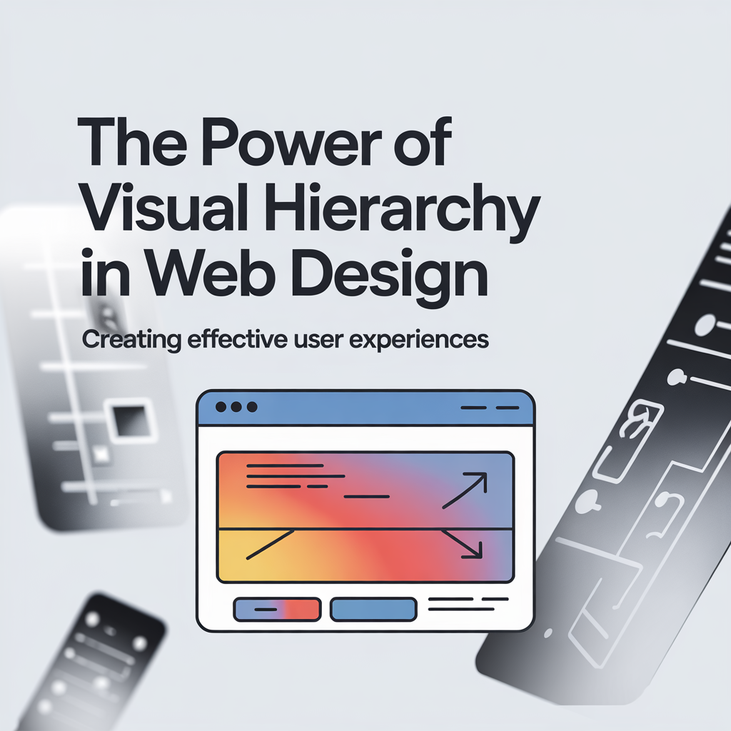
Visual hierarchy is a fundamental principle in web design that influences how users interact with a website. It determines what elements stand out, guiding attention to key content. Understanding and applying visual hierarchy correctly can enhance usability, improve user engagement, and drive conversions.
What is Visual Hierarchy in Web Design?
Definition and Importance
Visual hierarchy is the arrangement of design elements to indicate their importance. This technique helps users navigate content intuitively, making their experience seamless. When done well, it ensures that visitors absorb critical information first, reducing frustration and enhancing usability.
Key Principles of Visual Hierarchy
Several design principles contribute to an effective visual hierarchy:
- Contrast: Differentiating elements using color, size, or weight to establish priority.
- Proximity: Grouping related elements together to improve readability.
- Alignment: Creating a structured layout that feels balanced and easy to follow.
- Whitespace: Using empty space strategically to prevent clutter and improve focus.
How Visual Hierarchy Enhances User Experience
Guiding User Attention Effectively
Users scan pages quickly, often following predictable patterns like the F-pattern or Z-pattern. By placing essential elements along these paths, designers can ensure that users focus on key information first. Strategic placement of headlines, buttons, and images can increase engagement and conversions.
Reducing Cognitive Load
A cluttered layout forces users to work harder to find what they need. Simplifying the design using hierarchy minimizes decision fatigue and frustration. A well-organized website directs attention naturally, making interactions effortless.
Best Practices for Implementing Visual Hierarchy
Size and Scale
Larger elements naturally draw attention. Headlines, call-to-action buttons, and featured images should be significantly larger than surrounding content. Scaling elements based on importance helps users prioritize information effortlessly.
Color and Contrast
Bright, bold colors can highlight key areas, while muted tones recede into the background. High contrast between text and background enhances readability. Using a consistent color scheme strengthens branding and maintains a cohesive design.
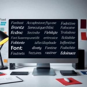
Typography and Spacing
Font choices influence readability and perception. Hierarchical typography, using different font weights, sizes, and styles, helps distinguish primary content from secondary details. Proper line spacing and paragraph breaks ensure a smooth reading experience.
Common Mistakes to Avoid
Overloading with Too Many Elements
Cluttering a page with excessive images, buttons, or text blocks dilutes the message. Users may struggle to identify what’s important, leading to frustration. Keeping designs clean and focused improves clarity.
Poor Contrast and Readability
Low contrast between text and background can make content difficult to read. Choosing accessible color combinations ensures inclusivity. Designers should test readability across different devices and lighting conditions.
Conclusion
Visual hierarchy plays a critical role in web design by improving usability and guiding user interactions. Applying principles like contrast, scale, and typography helps create a seamless experience. By avoiding common mistakes and focusing on clarity, designers can enhance engagement and make websites more effective.