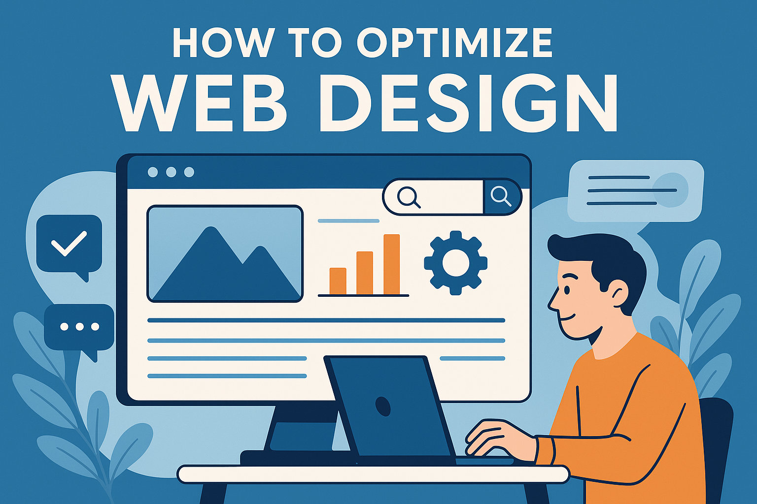
How to Optimize Web Design
Effective web design isn’t just about aesthetics—it’s about function, speed, usability, and accessibility. A well-optimized website reduces bounce rates, improves conversions, and boosts your rankings on search engines.
This guide outlines essential strategies to enhance design, performance, and usability across all devices.
Why Web Design Optimization Matters
Impact on User Experience (UX)
User experience is central to web design. An intuitive layout helps visitors find what they need quickly. Poor structure, slow load times, and cluttered visuals frustrate users, pushing them to leave.
Optimized web design ensures:
- Fast-loading pages
- Clear CTAs (calls-to-action)
- Logical page flow
- Consistent branding
Positive UX increases dwell time and user satisfaction. Even small tweaks like improving font legibility or simplifying navigation can make a big difference. Always prioritize the user’s journey over decorative elements.
Influence on SEO and Rankings
Search engines reward optimized websites. Google prioritizes mobile-friendly, fast, accessible pages in its ranking algorithm. A clean codebase, fast-loading images, and structured content improve crawlability.
Key SEO design factors:
- Mobile responsiveness
- Fast page speeds
- Semantic HTML
- Clean navigation
Design and SEO must work together. Don’t just build for appearance—build for visibility and accessibility too.
Key Elements of Effective Web Design
Visual Hierarchy and Layout
A clear visual hierarchy guides users through your content. Use contrasting font sizes, color contrast, spacing, and section dividers to establish order.
Best practices:
- Use H1 for main titles, H2 for subtopics
- Apply consistent margins and padding
- Break text into digestible sections
- Place CTAs above the fold
Keep the layout simple. Too many focal points confuse users. Prioritize clarity and flow.
Navigation and Structure
Navigation should be predictable. Users should understand where they are and where they can go.
Optimize by:
- Keeping navigation menus short and logical
- Using breadcrumb trails
- Designing sticky headers on mobile
- Linking key internal pages
Structure affects SEO and user retention. Organize content around topic clusters and maintain consistent URL patterns.
Mobile Optimization
Responsive vs. Adaptive Design
Responsive design uses flexible grids to adapt content to any screen size. Adaptive design loads different layouts for different devices.
Responsive is generally preferred because:
- It’s easier to maintain
- Google recommends it
- It provides consistent user experience
However, adaptive can offer more control on specific devices. Choose based on your target audience and resources.
Mobile Page Speed Tips
Mobile users expect quick load times. A delay of even one second can hurt engagement.
Speed tips:
- Use compressed images (WebP format preferred)
- Minify CSS, JavaScript, and HTML
- Enable lazy loading
- Reduce server response time
Use tools like Google PageSpeed Insights to test performance.
Website Performance and Speed
Speed is a ranking factor and a UX necessity. Optimized websites load in under 3 seconds.
To enhance performance:
- Use a content delivery network (CDN)
- Implement browser caching
- Optimize fonts and use system defaults when possible
- Limit third-party scripts
Avoid unnecessary animations and plugins. Every element added should serve a purpose. Track performance with tools like GTmetrix or Lighthouse.
Accessibility Best Practices
Accessibility makes your site usable for people with disabilities. It’s not just ethical—it’s legally required in many regions and improves SEO.
Key steps:
- Add alt text to all images
- Ensure keyboard navigation works
- Use ARIA roles appropriately
- Maintain color contrast ratios (4.5:1 or higher)
- Include clear form labels
Test with screen readers like NVDA or tools like WAVE. An accessible site reaches a wider audience and performs better overall.
SEO-Focused Design Considerations
SEO and design go hand-in-hand. Structure your website for both bots and users.
Effective strategies:
- Use semantic HTML (header, section, article)
- Optimize headings with target keywords
- Keep URLs short and descriptive
- Add schema markup
- Create internal links between relevant content
Avoid hidden content or keyword stuffing. SEO should support the user’s experience—not hinder it.
Tools to Audit and Improve Your Website
Use reliable tools to track and optimize web design.
Recommended:
- Google Lighthouse: Audits performance, accessibility, SEO
- Hotjar: Tracks user behavior through heatmaps
- Google Analytics: Monitors traffic and bounce rates
- Screaming Frog: Identifies broken links and crawl issues
- WebPageTest: Evaluates speed metrics across regions
Schedule regular audits. A site that performs well today may fall behind tomorrow. Continuous improvement keeps your site competitive.