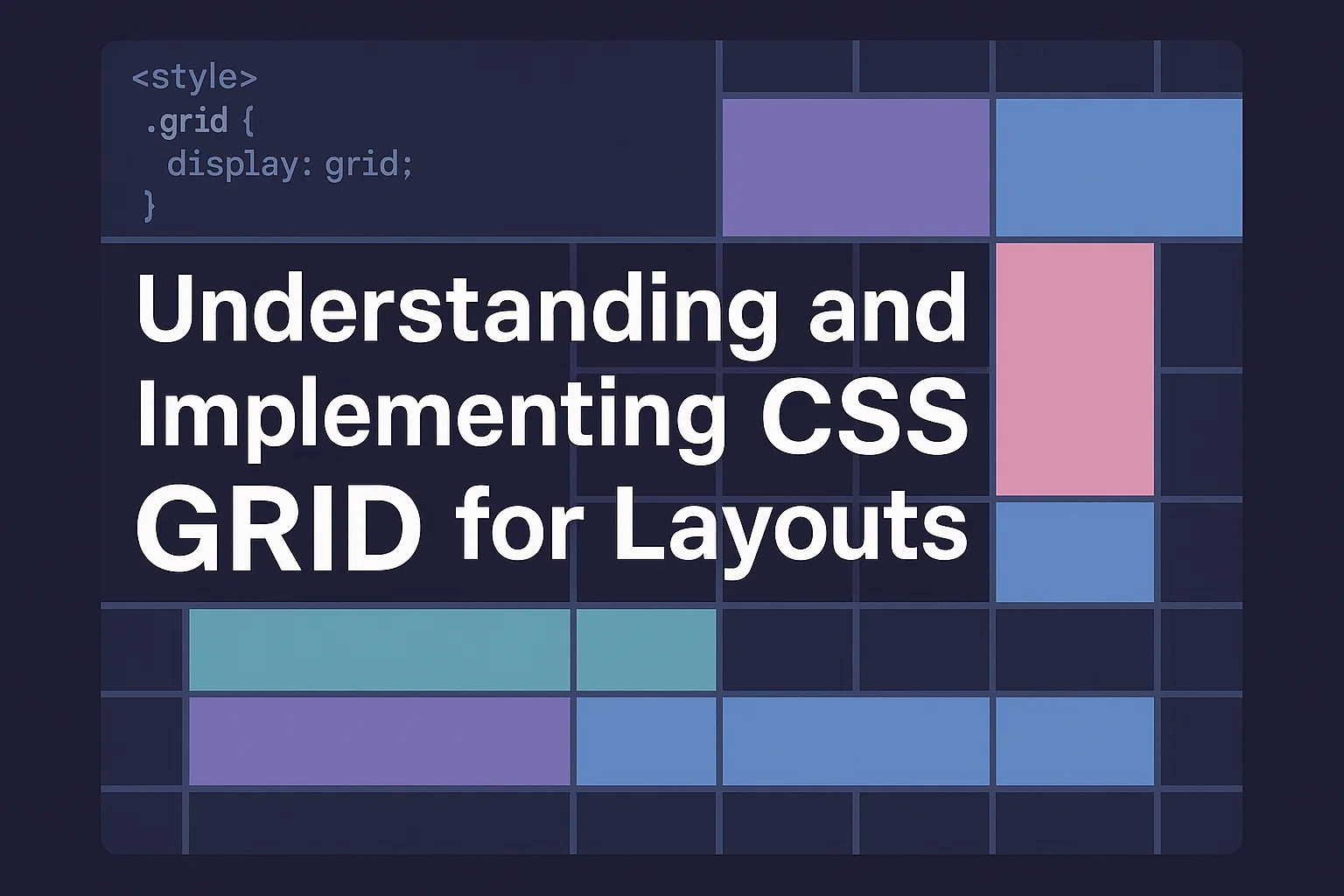
Introduction to CSS Grid
CSS Grid transforms web design by enabling two-dimensional layouts.
Unlike older methods relying on floats or tables, Grid makes complex layouts simpler, cleaner, and easier to maintain.
With support in all major browsers, it has become essential for modern responsive design.
This guide walks through what CSS Grid is, why it matters, and how to apply it practically.
Whether you’re new to CSS or updating your workflow, these concepts will help you build flexible, user-friendly designs.
Why CSS Grid Matters for Modern Web Design
Websites today must look good on screens of every size.
Traditional layout tools can feel limiting and messy, especially when dealing with complex designs.
CSS Grid offers built-in responsiveness, better alignment control, and clearer code structure.
Designers can create balanced, adaptable layouts without extra markup or hacks.
By improving code readability and reducing CSS complexity, CSS Grid saves time and supports maintainability.
It’s not just a new tool, it’s a fundamental shift toward flexible, modern design systems.
Key CSS Grid Concepts and Terminology
Grid container: The parent element where the grid is applied using display: grid.
Grid items: Direct child elements of the grid container.
Grid lines: Invisible horizontal and vertical lines that structure placement.
Grid tracks: Space between grid lines, including rows and columns.
Grid areas: Named sections of the grid defined with grid-template-areas.
Explicit vs. implicit grid: Explicit grids are defined in CSS, while implicit grids are created when content exceeds the declared structure.
Understanding these basics helps avoid confusion and build layouts confidently.
Step-by-Step Guide to Building Layouts with CSS Grid
Setting Up a Basic Grid
Create a container and set display: grid;.
Use properties like grid-template-columns and grid-template-rows to define the structure.
Example:
css
CopyEdit
.container {
display: grid;
grid-template-columns: repeat(3, 1fr);
grid-gap: 20px;
}
This creates three equal-width columns with a 20px gap.
Keep your grid scalable by using fractional units (fr) or percentages instead of fixed pixel values.
Placing Items on the Grid
Use grid-column and grid-row to place items exactly where you want.
For named areas, define them in grid-template-areas and assign items using grid-area.
Example:
css
CopyEdit
.container {
grid-template-areas:
“header header”
“sidebar main”;
}
.header { grid-area: header; }
.sidebar { grid-area: sidebar; }
.main { grid-area: main; }
Named areas make code easier to read and maintain, especially for larger layouts.
Responsive Design with CSS Grid
CSS Grid handles responsiveness naturally, but combine it with media queries for more control.
Example:
css
CopyEdit
@media (max-width: 768px) {
.container {
grid-template-columns: 1fr;
}
}
This turns multi-column grids into a single column on smaller screens.
Use auto-fit or auto-fill with minmax() to create grids that adjust automatically to screen size.
Common CSS Grid Patterns and Use Cases
- 12-column grids: Popular for complex responsive layouts.
- Card layouts: Equal-height, flexible-width cards in a grid.
- Holy Grail layout: Header, footer, sidebar, and main content.
- Image galleries: Grids that resize and reflow on different devices.
These patterns save time and help maintain consistency across designs.
CSS Grid vs. Flexbox: When to Use Each
CSS Grid: Best for full-page or component layouts where rows and columns align together.
Flexbox: Better for linear, one-dimensional layouts like nav bars or lists.
Often, they work well together: Grid for overall structure, Flexbox for internal alignment.
Choosing the right tool depends on your content and design goals.
Best Practices and Accessibility Tips
- Always define fallback layouts for browsers lacking support.
- Use semantic HTML to improve screen reader compatibility.
- Keep CSS modular and reusable.
- Test on multiple devices and screen sizes.
- Avoid fixed pixel sizes; use responsive units instead.
Accessible, flexible design improves usability for everyone and benefits SEO.
Conclusion: Mastering CSS Grid
CSS Grid changes how developers approach layouts, offering power and flexibility without added complexity.
By learning its core principles and patterns, you can build responsive, maintainable designs that look great on any device.
Practice, test, and refine, your layouts will only get better over time.