Designing Logos That Stand the Test of Time
A logo is more than a graphic.
It represents a brand’s identity and sets the tone for how people perceive it.
Some logos evolve slightly over time, but the strongest designs hold their essence for decades.
This is the hallmark of timeless logo design.
Brands that achieve this balance avoid chasing fleeting trends.
Instead, they invest in principles that emphasize clarity, adaptability, and relevance.
In this article, we’ll break down why timeless logos matter, the core principles that make them last, pitfalls to avoid, and practical steps you can take to build one.
Why Timeless Logos Matter for Brands
A logo isn’t just a design—it’s the face of a business.
For many brands, it’s the first element people recognize and remember.
That makes longevity essential.
Timeless logos offer stability.
They create consistency in how a brand appears across decades.
This stability builds trust, which is critical for long-term customer relationships.
When a logo constantly changes to match trends, it can confuse audiences and weaken recognition.
Another advantage of timeless logos is cost efficiency.
Redesigning a logo often means updating signage, packaging, websites, and more.
Frequent changes not only incur expenses but also risk disrupting brand continuity.
Timeless designs also thrive across evolving platforms.
Whether displayed on print ads from the 1990s or social media apps today, a strong logo retains clarity.
It adapts without losing identity.
Finally, logos that last often become cultural icons.
Think of the Nike swoosh or Apple’s bitten apple.
These symbols outlive design fads and cement themselves in global recognition.
In short, timeless logos provide reliability, save resources, and secure lasting recognition—critical assets for any business aiming to endure.
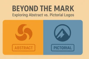
Core Principles of Timeless Logo Design
A timeless logo isn’t built on luck—it follows key principles.
Three stand out: simplicity, versatility, and balance.
Simplicity Above All
Simple logos are easier to recognize and remember.
A design overloaded with detail often fails at smaller scales or across different formats.
Minimalist designs cut through noise, ensuring clarity whether on a billboard or a phone screen.
Simplicity doesn’t mean boring—it means purposeful.
Every line and curve should have meaning.
Logos like McDonald’s golden arches or Adidas’ three stripes prove that less can truly be more.
By removing unnecessary complexity, brands ensure their logo stands the test of time.
Versatility Across Platforms
A timeless logo works everywhere.
From social media avatars to packaging labels, it must remain effective at different scales and in different contexts.
This means designing for adaptability.
A versatile logo should look good in black and white, hold up in digital and print, and remain legible in both small and large formats.
Brands like FedEx and Coca-Cola showcase adaptability without losing core identity.
Their designs stay consistent across decades while fitting seamlessly into new mediums.
Balance and Proportion
Logos must be visually balanced.
Proportion ensures the design feels stable and harmonious, which strengthens memorability.
Poorly balanced logos can feel awkward, leading to weaker impressions.
Timeless designs often use symmetry, clear spacing, and thoughtful proportions to maintain equilibrium.
Consider Target’s bullseye—perfectly centered, proportionate, and instantly recognizable.
Such balance ensures lasting appeal.
Common Pitfalls to Avoid in Logo Design
While timeless design relies on proven principles, mistakes can shorten a logo’s lifespan.
One major pitfall is over-reliance on trends.
Gradients, complex effects, or hyper-detailed styles may look fresh initially but age poorly.
A logo should feel relevant regardless of decade, not tied to one design fad.
Another mistake is excessive detail.
Logos overloaded with intricate elements fail to scale well, losing clarity on small screens or products.
Typography missteps are also common.
Choosing overly decorative or novelty fonts may work for short-term appeal but rarely stand the test of time.
Classic, legible fonts hold up better.
Finally, ignoring cultural perception can damage longevity.
Symbols or styles that resonate in one era may become problematic later.
Designers must account for broad cultural contexts and adaptability.
Avoiding these pitfalls helps ensure a logo remains strong, consistent, and relevant across decades.
Examples of Logos That Have Endured
Some logos prove timeless principles in action.
- Nike Swoosh: Designed in 1971, it remains one of the most recognizable symbols worldwide. Its simplicity and motion-driven form give it lasting energy.
- Apple: While the colors and finishes have changed, the bitten apple shape has stayed the same since 1977. Its clarity and symbolism are unmatched.
- Coca-Cola: The script has endured since the late 19th century, reflecting heritage while maintaining legibility.
- Target: The bullseye design, introduced in 1962, is a masterclass in proportion and simplicity.
These logos prove that minimalism, adaptability, and consistent use build recognition over decades.
They may evolve slightly, but their essence never changes.
Brands aiming for timelessness should study these examples.
They demonstrate that strong principles outlast fleeting design trends.
Practical Steps to Create a Logo That Lasts
Designing a timeless logo requires process and discipline.
- Research the brand deeply—understand values, audience, and positioning.
- Sketch multiple concepts—focus on simplicity and symbolism.
- Test versatility—ensure the design works in color, black and white, large, and small formats.
- Refine typography—choose fonts that are legible, balanced, and not tied to passing trends.
- Seek feedback—test with real audiences to ensure clarity and memorability.
- Avoid rushing—timeless logos often emerge from refinement, not quick fixes.
By following these steps, designers can move beyond short-term style to create logos with lasting value.
Final Thoughts
Timeless logos are strategic assets, not just visual elements.
They build trust, reduce costs, and provide consistent recognition across decades.
Brands that succeed with timeless logos focus on simplicity, versatility, and balance.
They avoid common pitfalls and study proven examples.
Most importantly, they design with intention—choosing clarity over complexity and purpose over fashion.
While trends may influence aesthetics, timeless logos remain steady.
They adapt without losing core identity.
That’s why logos like Nike, Coca-Cola, and Apple have endured.
For businesses today, the lesson is clear:
A logo should outlive trends, platforms, and design fads.
By grounding design in principles that emphasize clarity and adaptability, you ensure your brand identity remains relevant for years to come.