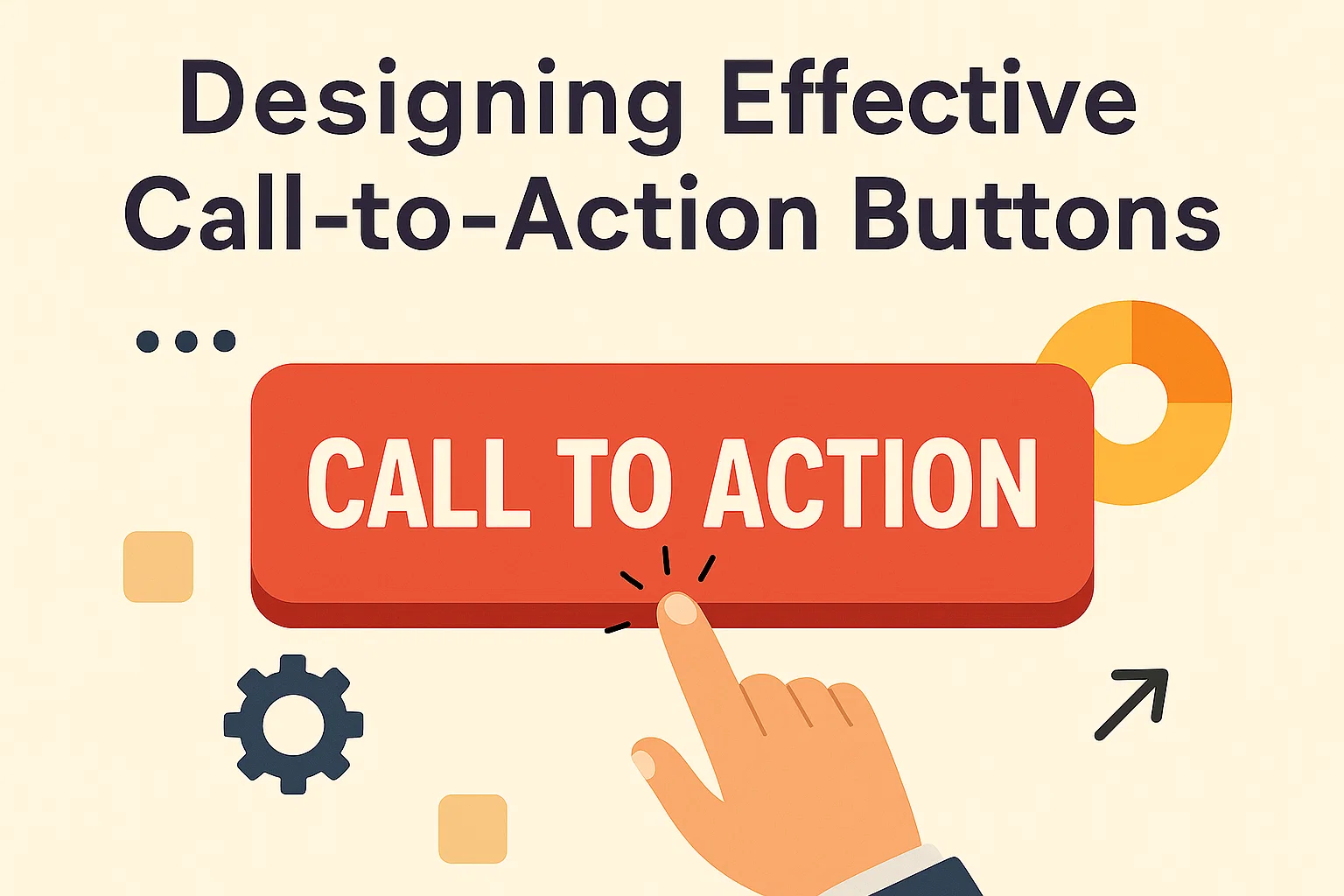
Why Call-to-Action Buttons Matter
Call-to-action (CTA) buttons are one of the most important elements of web design. They guide users toward key actions—signing up, purchasing, or downloading—making them essential for conversions.
A well-designed CTA removes hesitation. Users know exactly what will happen when they click. Poorly designed CTAs, on the other hand, create confusion or go unnoticed, leading to lost opportunities.
Effective buttons balance visual appeal with clear messaging. They need to stand out without overwhelming the page. Since most websites include multiple actions, the most important CTA must be the most visible.
Research shows even small improvements to CTA design can significantly increase conversion rates. Color, placement, and wording all play a role. The button should not only attract attention but also feel natural within the overall design.
For businesses, CTAs represent the bridge between visitor interest and measurable results. A clear and well-placed button helps users move from browsing to taking action.
Ultimately, CTA buttons are not just about design—they’re about usability. The best buttons are obvious, trustworthy, and easy to engage with.
Core Principles of CTA Button Design
Good CTA design is built on clarity, visibility, and usability. The goal is to make the next step obvious and compelling.
The button should use short, action-driven text. Phrases like “Get Started,” “Buy Now,” or “Join Free” perform better than vague terms like “Click Here.” The wording sets expectations and encourages immediate action.
Visual hierarchy is another critical factor. A CTA should stand out from other elements without breaking design consistency. Designers often use contrasting colors, larger sizes, or distinct shapes to make the button easy to spot.
Placement affects engagement as much as design. A button must appear where users are most likely to act. Above the fold is common, but repeating CTAs at natural decision points also helps.
Finally, consistency builds trust. Users should see similar button styles across a site, reinforcing brand identity while avoiding confusion.
By focusing on clear text, strong visual contrast, and strategic placement, businesses can create buttons that guide users effectively.
Clarity in Messaging
CTA text should be short, clear, and direct. The user must know exactly what will happen when they click.
Using verbs creates urgency and direction. “Start Free Trial” is stronger than “Learn More” because it sets a clear outcome. Avoid vague or generic phrases that add friction.
Clarity also builds trust. Overpromising or misleading text leads to frustration and drop-offs. Consistent, action-oriented wording improves engagement.
Visual Hierarchy and Contrast
The most effective CTA buttons stand out without clashing. Designers often use contrasting colors against the background to draw attention.
Size also matters. The button should be large enough to notice but not so large that it disrupts the flow of the page. White space around the button increases visibility.
Consistent styling across the site reinforces recognition. Users should instantly know which element is the call-to-action.
Placement and Positioning
Placement is just as important as design. CTAs should appear where users are most likely to decide.
Above the fold ensures immediate visibility. However, placing buttons at the end of sections or product descriptions captures users after they’ve processed key information.
Repeating CTAs on longer pages helps maintain engagement without forcing users to scroll back. Strategic positioning increases both visibility and usability.
Color Psychology in CTA Buttons
Color influences user behavior. Different colors trigger different emotional responses, making them powerful in CTA design.
Red and orange create urgency and excitement, making them effective for sales or time-limited offers. Green suggests growth and success, often used for sign-ups or checkout. Blue conveys trust and reliability, commonly chosen for financial services or software.
The key is contrast. A button should stand out against its background without straining the eyes. Testing multiple color variations can reveal which performs best for a specific audience.
While psychology plays a role, brand alignment is also crucial. A color must feel consistent with the website’s overall design and identity.
Ultimately, no single color works best for all businesses. Testing and context matter more than following universal rules.
Mobile-Friendly CTA Design
With most web traffic coming from mobile devices, CTA buttons must be optimized for small screens.
Buttons should be large enough to tap without zooming, with adequate spacing to avoid accidental clicks. Rounded corners and high-contrast colors improve visibility on touchscreens.
Placement also shifts on mobile. Sticky CTAs—buttons fixed at the bottom of the screen—perform well because they remain accessible while users scroll.
Loading speed is another factor. Heavy graphics or oversized buttons slow performance, frustrating mobile users. Lightweight design ensures quick interaction.
Since mobile users often browse with one hand, thumb-friendly placement is essential. Buttons near the bottom right or centered are easiest to reach.
By prioritizing usability and accessibility on mobile, businesses create smoother, more effective experiences that drive conversions.
Accessibility Considerations for CTA Buttons
Accessibility ensures all users can engage with CTAs. Designing buttons for inclusivity improves usability for everyone.
Contrast ratios must meet accessibility guidelines. Light text on light backgrounds should be avoided. At least a 4.5:1 contrast ratio ensures readability.
Text labels should always describe the action. Icons alone are not enough, as screen readers need descriptive text to communicate intent.
Keyboard navigation is another key factor. Users should be able to reach and activate buttons without a mouse. Proper HTML markup supports this.
Focus states help users track where they are on the page. A clear highlight or outline ensures buttons are visible during keyboard navigation.
By making CTA buttons accessible, businesses expand their reach and comply with web standards, improving both usability and SEO.
Measuring CTA Performance
Designing CTAs is only half the job. Measuring performance ensures they deliver results.
Click-through rate (CTR) is the most direct measure. A high CTR means users find the button appealing and clear. Low CTR suggests issues with wording, placement, or visibility.
Conversion rate goes a step further. It tracks how many users completed the intended action after clicking. Strong CTAs increase both clicks and conversions.
A/B testing is the best method to refine CTA design. By testing variations in text, color, or placement, businesses can identify what works best for their audience.
Heatmaps and scroll tracking provide deeper insights. They show where users engage or lose interest, guiding adjustments in button placement.
Regular testing ensures CTAs stay effective as user behavior changes. Continuous optimization leads to long-term gains in engagement and conversions.
Final Thoughts
Call-to-action buttons are small elements with big impact. They guide users, drive engagement, and directly influence conversions.
Designing effective CTAs requires clarity in wording, visibility through contrast, and strategic placement. Color psychology and mobile optimization further strengthen their performance. Accessibility ensures inclusivity, while testing validates results.
Businesses that invest in well-designed CTAs see measurable improvements. Even minor adjustments in button text, size, or color can boost conversions significantly.
Ultimately, effective CTAs align design with user intent. They are not just buttons—they are decision points that move users closer to action.
Clear, accessible, and mobile-friendly CTAs ensure every visitor has the opportunity to engage. Consistency, testing, and usability transform buttons from simple design elements into powerful conversion tools.