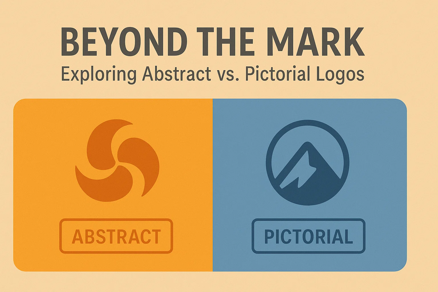
Beyond the Mark: Exploring Abstract vs. Pictorial Logos
Logos shape brand perception instantly.
Two common types, abstract and pictorial, offer distinct paths for representing your business visually.
This guide explains what makes them different, why it matters, and how to choose.
What Are Abstract Logos?
Abstract logos use shapes, lines, and forms without literal imagery.
They focus on evoking ideas and emotions rather than depicting a clear object.
These marks rely on visual metaphors.
Think of Nike’s swoosh symbolizing motion or Adidas’s three stripes suggesting strength.
Advantages include:
- Versatility across cultures and markets
- Timeless appeal less tied to trends
- Unique visual identity that stands out
Challenges:
- May require extra brand storytelling to explain meaning
- Risk of being too vague if poorly executed
Good abstract logos feel modern and scalable.
They fit everything from small app icons to billboards while retaining clarity.
For startups seeking flexibility and future growth, an abstract mark often makes sense.
Key Features of Abstract Logos
- Simple geometric or organic shapes
- Balanced composition for quick recognition
- Concept-driven, aligning with brand values
- Works well in monochrome and color variants
- Adaptable across print and digital media
When crafted carefully, abstract logos become instantly recognizable symbols.
What Are Pictorial Logos?
Pictorial logos use recognizable imagery, animals, objects, or symbols directly tied to brand identity.
They’re concrete, making it easier to communicate what your brand offers.
Famous examples: Apple’s apple, Twitter’s bird, or Target’s bullseye.
Such symbols help audiences connect faster, even without text.
Advantages include:
- Immediate visual meaning
- Easier storytelling about brand mission
- Strong emotional connection with audiences
Challenges:
- Harder to localize if imagery is culturally specific
- May look dated if overly trendy or detailed
A pictorial mark often fits brands with clear products or services wanting fast recognition.
Key Features of Pictorial Logos
- Literal or stylized representation of real objects
- Clear, memorable silhouette
- Scales down while staying identifiable
- Combines seamlessly with wordmarks if needed
- Evokes direct associations with products or brand story
Pictorial logos shine when clarity and quick recall matter most.
Choosing Between Abstract and Pictorial Logos
![]()
Choosing depends on your brand goals, audience, and market.
Use an abstract logo if:
- You want flexibility to grow into new markets or services
- The brand message is concept-driven, not product-specific
- You seek a minimalist, modern aesthetic
Use a pictorial logo if:
- Your product/service is clear and tangible
- Fast recognition and direct association help build trust
- You want to tell a visual story immediately
Consider cultural factors too.
What resonates locally may not work globally.
Collaborate with designers to test how each style looks in different sizes and uses: packaging, apps, websites.
Brand Examples and Best Practices
- Abstract: Pepsi, Nike, Mitsubishi – universal shapes, concept-focused
- Pictorial: Starbucks, WWF, Shell – instantly recognizable images tied to brand
Best practices:
- Prioritize simplicity over complex detail
- Ensure scalability and clarity at all sizes
- Test logo variations across backgrounds and media
- Align design with brand values, not just aesthetics
Choose what tells your story best.
Final Thoughts
Both abstract and pictorial logos can become iconic.
Success comes from clarity, relevance, and execution, choosing the style that best fits your brand strategy.
A well-designed logo transcends trends and speaks for your brand long after launch.