The Psychology Behind Effective Color Palettes in Web Design
Colors are not just visual choices in web design , they influence how users feel, think, and act.
A well-planned color palette can improve brand recognition, guide user behavior, and even affect purchase decisions.
In this guide, we’ll explore how to select color combinations that work both visually and psychologically.
You’ll learn the principles of color psychology, the role of cultural differences, and how to apply color theory to create designs that perform.
Why Color Matters in Web Design
Color is often the first design element users notice. Within seconds, it can signal brand personality, quality, and trustworthiness.
Studies show that up to 90% of initial impressions are based on color alone.
Colors influence user emotions and decision-making. For example, blue often conveys stability and trust, making it popular in finance and healthcare sites.
Bright, warm tones like orange and red can encourage action, which is why they’re common in calls-to-action.
Beyond aesthetics, color improves usability. Contrast helps text readability, while consistent use of brand colors strengthens recognition.
Poor color choices, on the other hand, can cause visual strain, alienate users, or create accessibility issues.
In short, color matters because it affects perception, reinforces branding, and shapes user interaction patterns.
An effective palette balances brand identity, accessibility, and emotional impact.
The Role of Color in User Perception
Colors act as nonverbal cues that set expectations. A sleek monochromatic palette can suggest sophistication, while playful combinations signal creativity.
The psychological link between color and perception means designers can guide how users interpret a brand.
For example, a deep navy background can suggest professionalism, while bright yellow accents create optimism and warmth.
Using consistent colors across touchpoints , from website to packaging , ensures brand cohesion and memorability.
Color as a Branding Tool
Strong brands often have signature colors that are instantly recognizable. Think of Coca-Cola red or Tiffany blue.
These colors carry meaning and reinforce identity without words.
In web design, brand colors should be applied to key interface elements such as navigation menus, buttons, and banners.
The goal is to make the brand feel cohesive while enhancing usability.
Core Principles of Color Psychology
Color psychology examines how hues affect human emotions and behavior.
For web designers, understanding these associations is essential for creating sites that connect with audiences.
While general trends exist, color perception can vary by culture, personal experience, and industry norms.
Still, certain emotional responses are widely recognized.
Blue is linked to trust and calm, green to balance and growth, red to excitement and urgency.
Neutral tones like gray and white provide balance and professionalism, while bold colors can make content pop.
Applying these principles helps designers create palettes that feel intentional rather than arbitrary.
Emotional Associations of Colors
- Red: Energy, urgency, passion
- Blue: Trust, calm, professionalism
- Green: Growth, health, balance
- Yellow: Optimism, creativity, attention-grabbing
- Black: Luxury, sophistication, authority
- White: Cleanliness, simplicity, openness
These associations guide users’ emotional responses and should align with brand messaging.
Cultural Differences in Color Interpretation
Color meanings shift across cultures.
For instance, white symbolizes purity in Western cultures but mourning in some Asian traditions.
Red represents luck in China but can signal danger elsewhere.
Designers working for international audiences should research cultural color meanings to avoid miscommunication.
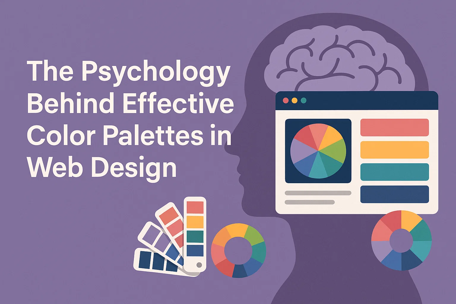
Applying Color Theory in Web Design
Color theory provides the framework for creating balanced, harmonious palettes.
It involves understanding relationships between colors on the color wheel and using contrast to enhance usability.
The most common approaches include:
- Monochromatic: Variations of one color
- Analogous: Colors next to each other on the wheel
- Complementary: Colors opposite each other for high contrast
- Triadic: Three evenly spaced colors for balanced vibrancy
A well-planned palette uses these methods to create visual interest without overwhelming the user.
Understanding Color Harmony
Harmony ensures colors work well together.
It’s about creating visual balance so no single color overpowers the others.
Designers can use harmony rules to create pleasing combinations and avoid clashes that cause visual discomfort.
Choosing a Primary and Secondary Palette
A primary palette includes brand-defining colors, while the secondary palette adds flexibility for accents, highlights, and backgrounds.
This system keeps designs consistent while allowing variety across different content types.
Impact of Color on User Behavior
Color choices influence how users interact with a site.
For example, changing a button from green to orange can significantly affect click-through rates.
Colors can also guide the eye toward important elements, create urgency, or encourage exploration.
Conversion Rate Optimization Through Color
Call-to-action buttons often use contrasting colors to stand out.
Testing variations through A/B experiments can reveal which colors drive higher conversions.
Accessibility and Inclusive Color Use
Accessible color design ensures everyone, including those with visual impairments, can use your site.
This includes meeting contrast ratios and avoiding problematic color combinations for color blindness.
Best Practices for Effective Color Palettes
- Keep it simple: 3–5 main colors
- Maintain consistent use across devices and touchpoints
- Test for accessibility compliance
- Use contrast for clarity and hierarchy
- Align with brand personality and audience expectations
Tools and Resources for Choosing Colors
Helpful tools include Adobe Color, Coolors, Color Hunt, and WCAG contrast checkers.
These can generate palettes, ensure harmony, and check accessibility compliance.
Conclusion: Creating a Color Strategy That Works
Effective color palettes blend psychology, brand identity, accessibility, and aesthetics.
By applying these principles, you can create designs that connect emotionally, perform well, and stand the test of time.